Channel 83
Year
2021 - 2023
Credits
Callum Paul - Founder
Blake Denford - Founder
Services
Typography, Apparel Graphics, Print Ready Artwork
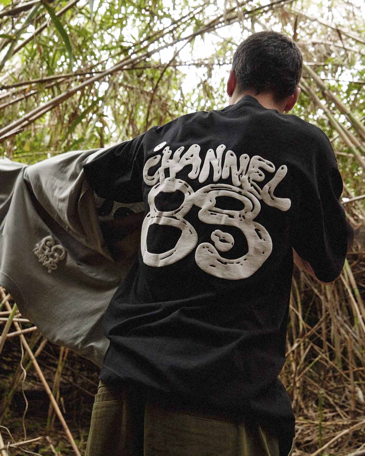
Channel 83's audience gravitates toward the niche, the kind of references only certain cinephiles would recognise. The type needed to speak that language, so I pulled from vintage graphics and cinematic title frames.
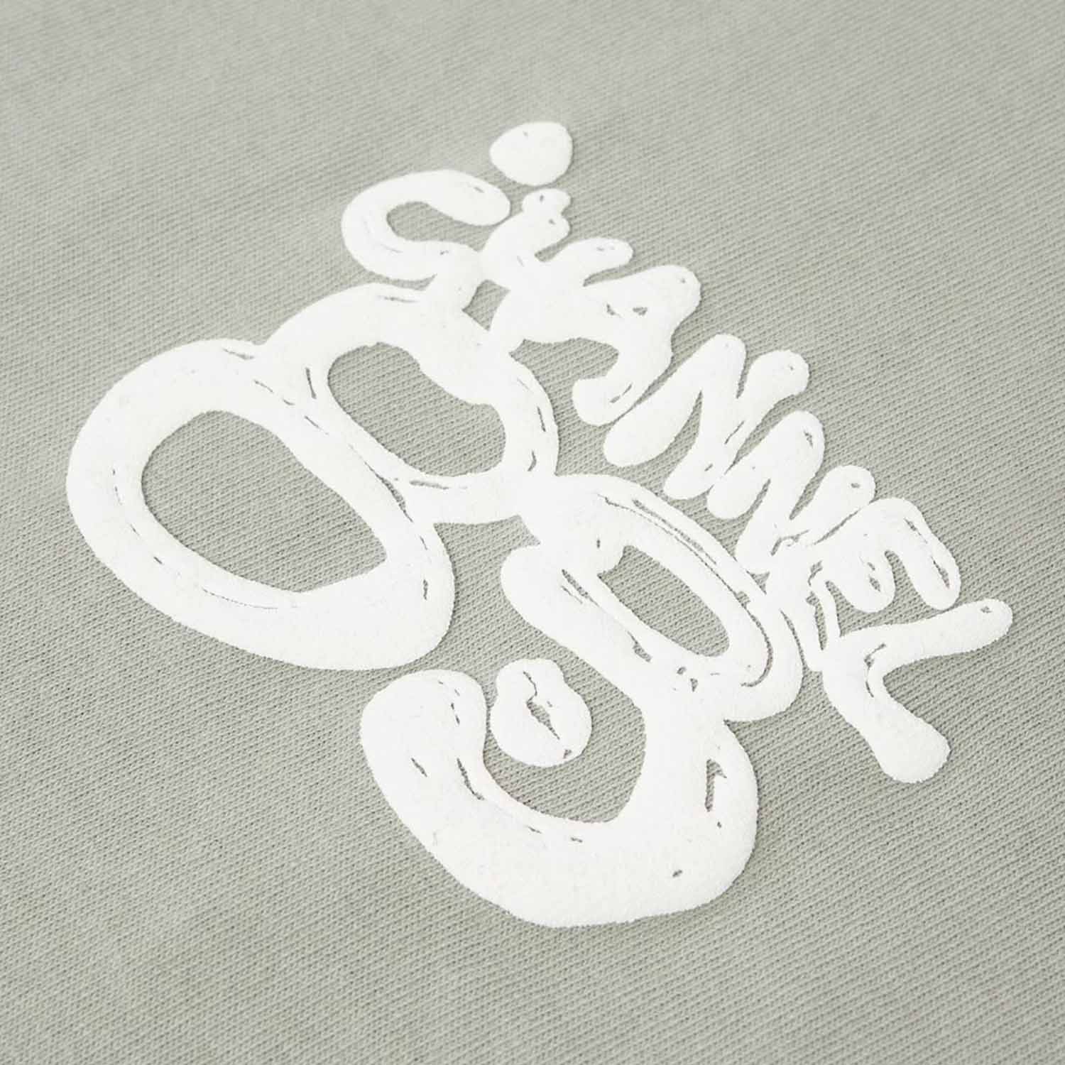
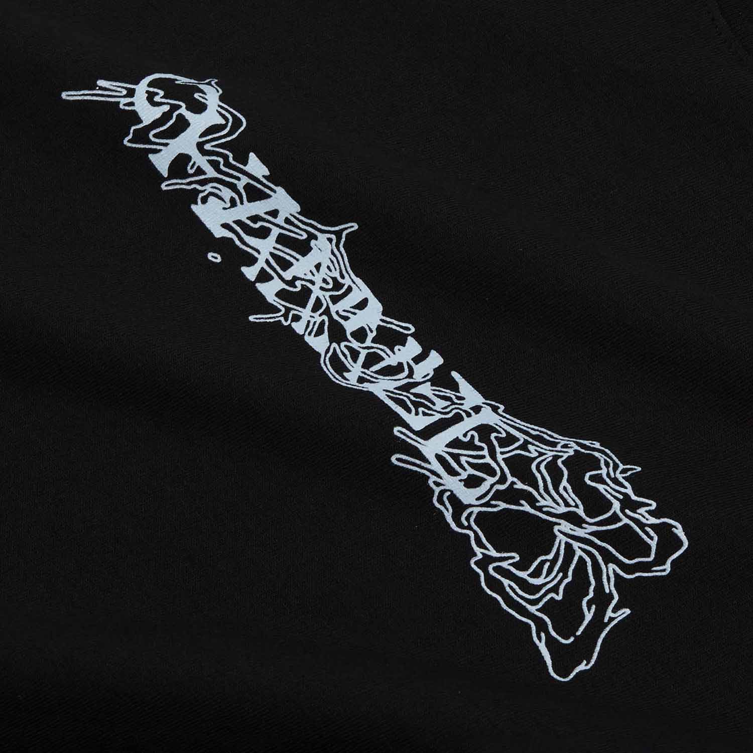
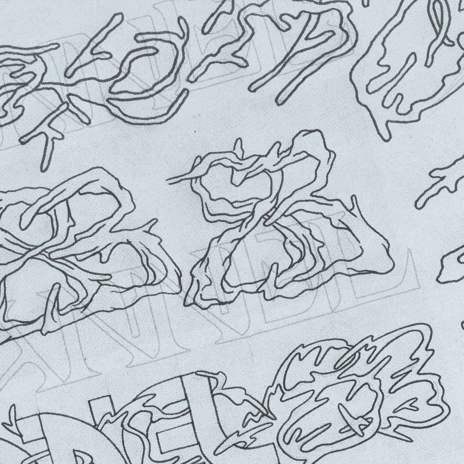
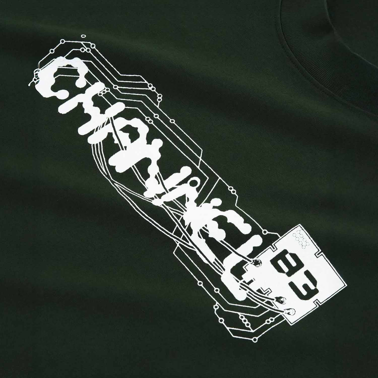
I treated the wordmark as a series of experiments instead of a single solution. One rebuilt "Channel 83" as a glitchy circuit board, cables running through the letterforms. Another went the opposite way, hand-drawn and almost caveman, like it was pulled from mud. A third reads like a living organism, closer to Cronenberg than conventional branding.
Each was applied in one colour across garments and small goods, letting the mark carry the weight.

BACK TO TOP