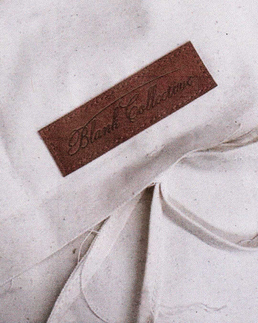
Blank Co. started as a name that meant something different to what it means now. When the brand launched in 2022, "Collective" reflected the founder's mindset at the time, a blank canvas, open collaboration, working across mediums and inviting others into the process. But as the founder's own interests narrowed toward studying true vintage garments, their proportion, fabrication, construction and purpose, the brand followed.
What began as open experimentation became disciplined product development, an archival-based menswear label refining historical garments for a modern wardrobe. That shift meant "Collective" no longer told the truth about what the brand was, so the rebrand started with the name itself, landing on "Co." Historically, "Co." wasn't stylistic branding, it was a literal, factual designation used across workwear, military and industrial goods labels in the late 19th and early 20th centuries to signal a registered company behind the product. That industrial, matter-of-fact language matched exactly what Blank Co. had become.
From there, I rebuilt the identity from first principles: research, reference study, concept development, iterative sketches and many rounds of refinement, aiming not for a stylistic update but for a mark with the same standard of construction as the garments it represents, one that could confidently lead the brand as it grows.
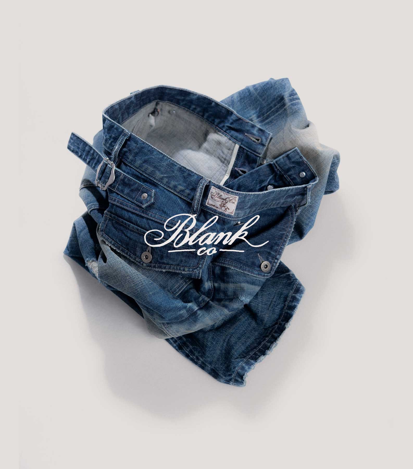
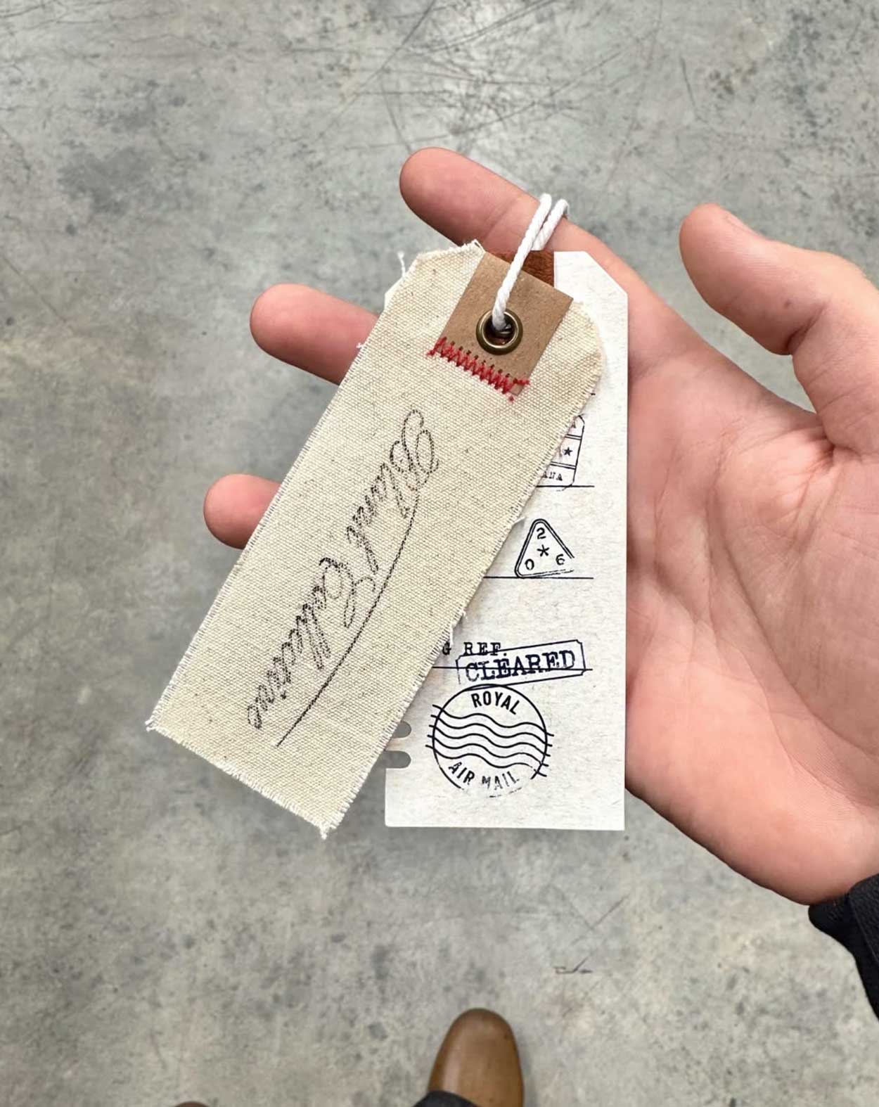
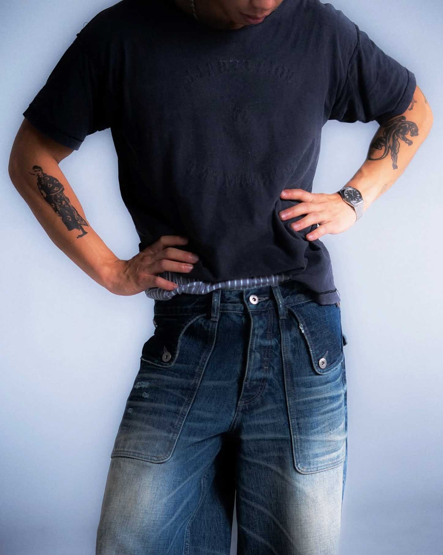
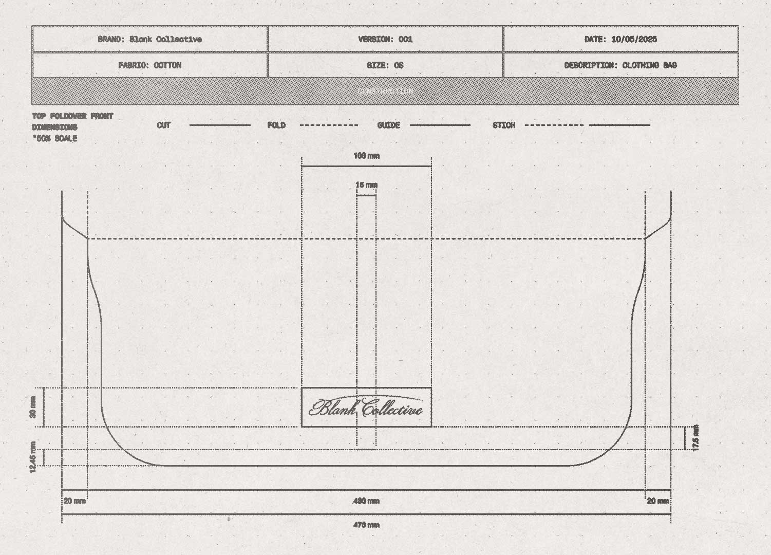
The resulting logotype has now rolled out across the website, socials, every current piece in store and the packaging system, with a monogram extension already developed as a small embossed leather zipper detail on a knitted jacket. It's early days for this brand, but the foundation is exactly what it needed to be: a name, and a mark, that finally tell the truth about the brand.