Privacy was built on the premise to keep the founder's identity out of it entirely and let the product carry the brand on its own. That meant the graphics couldn't lean on a name or a face, they had to stand out purely as good design. SS25 was the first real test of that idea, the brand's first drop of larger graphics that moved beyond a simple wordmark alternative, built off the back of strong customer demand for more than just the logo.
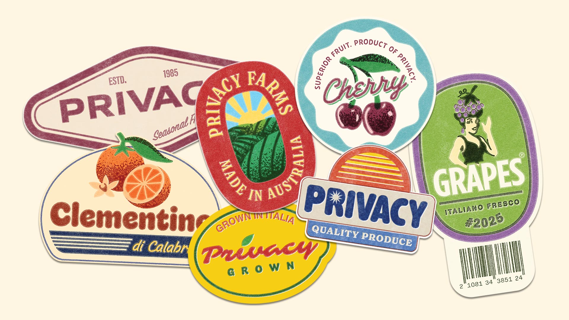
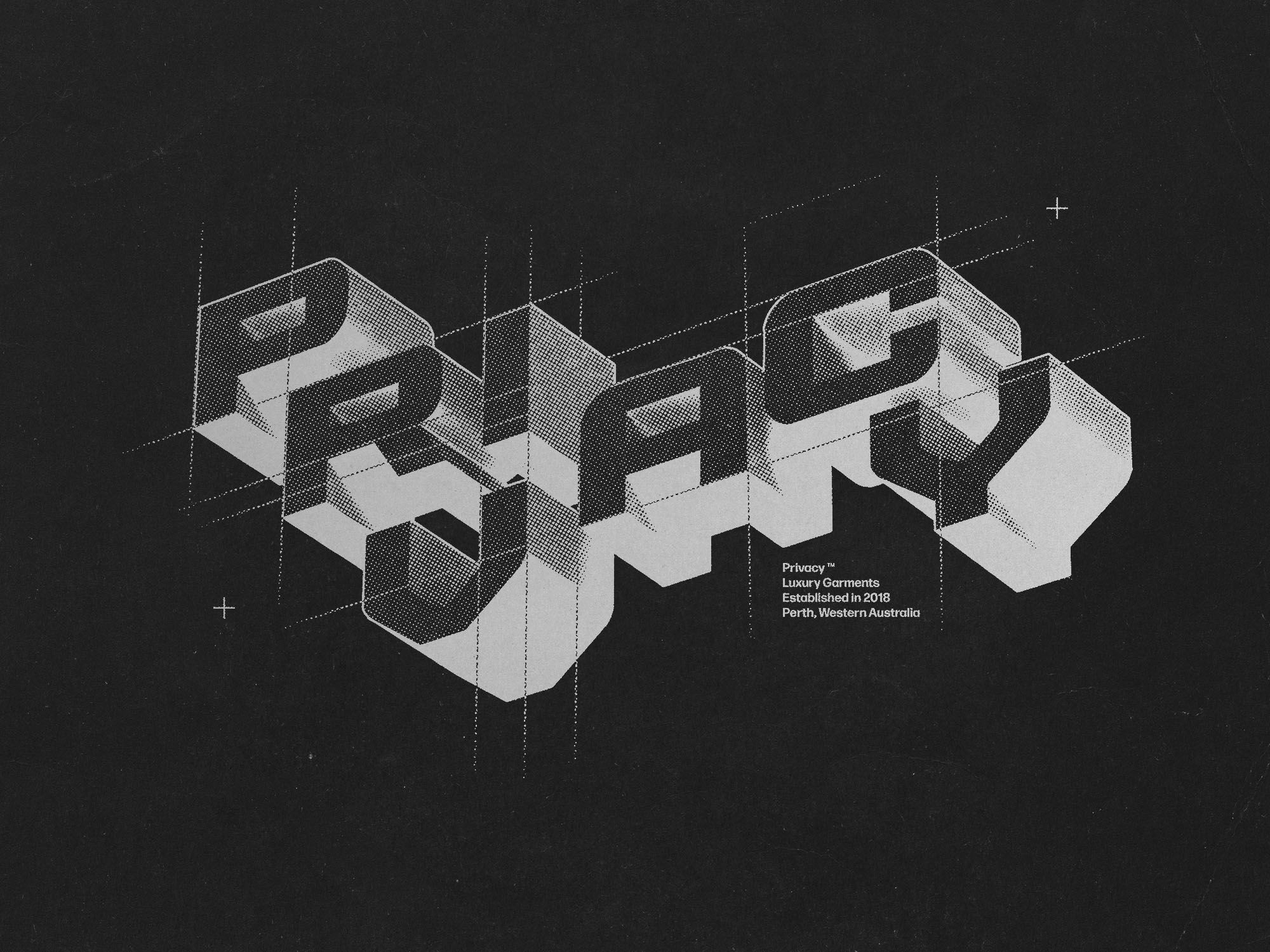
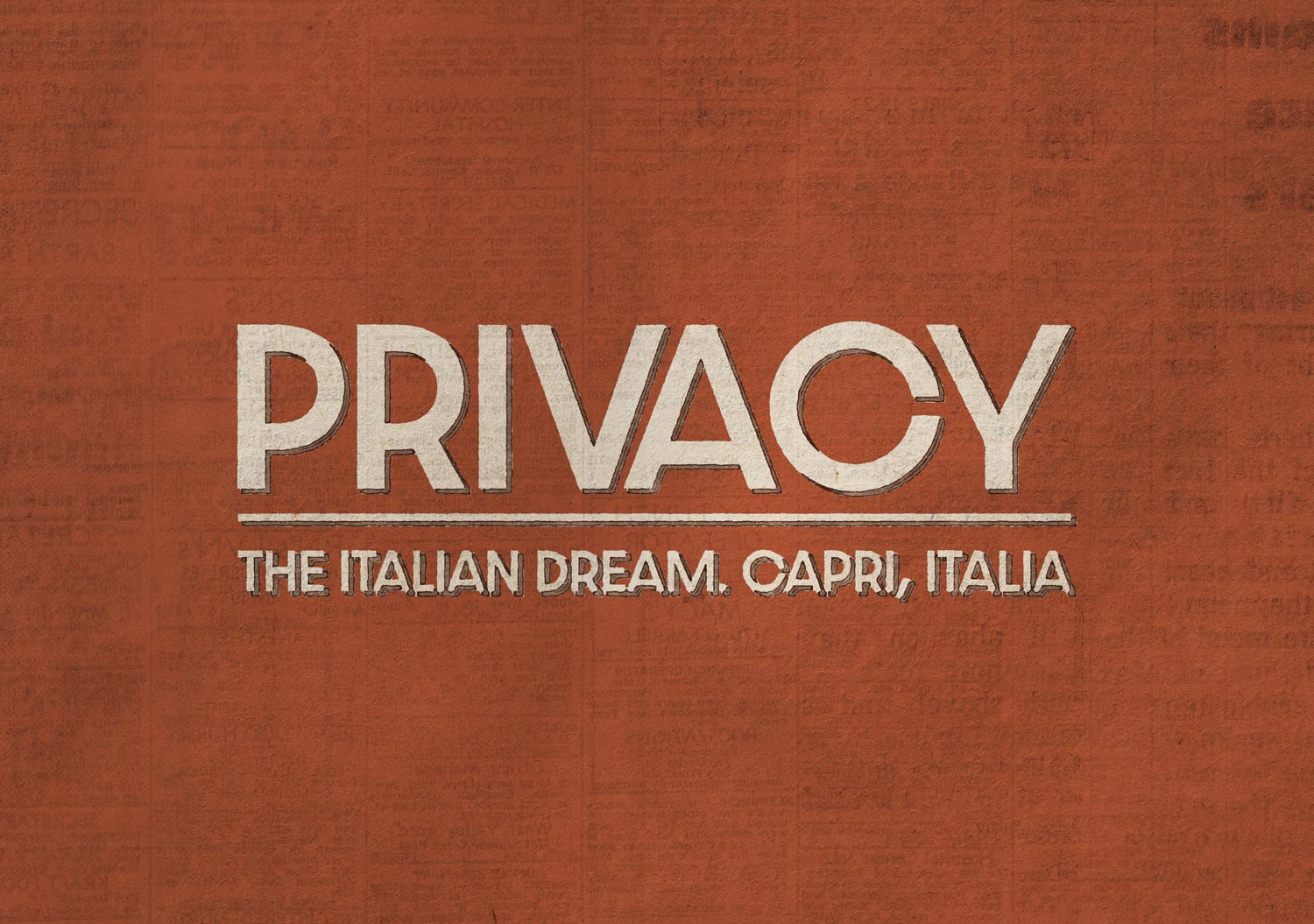
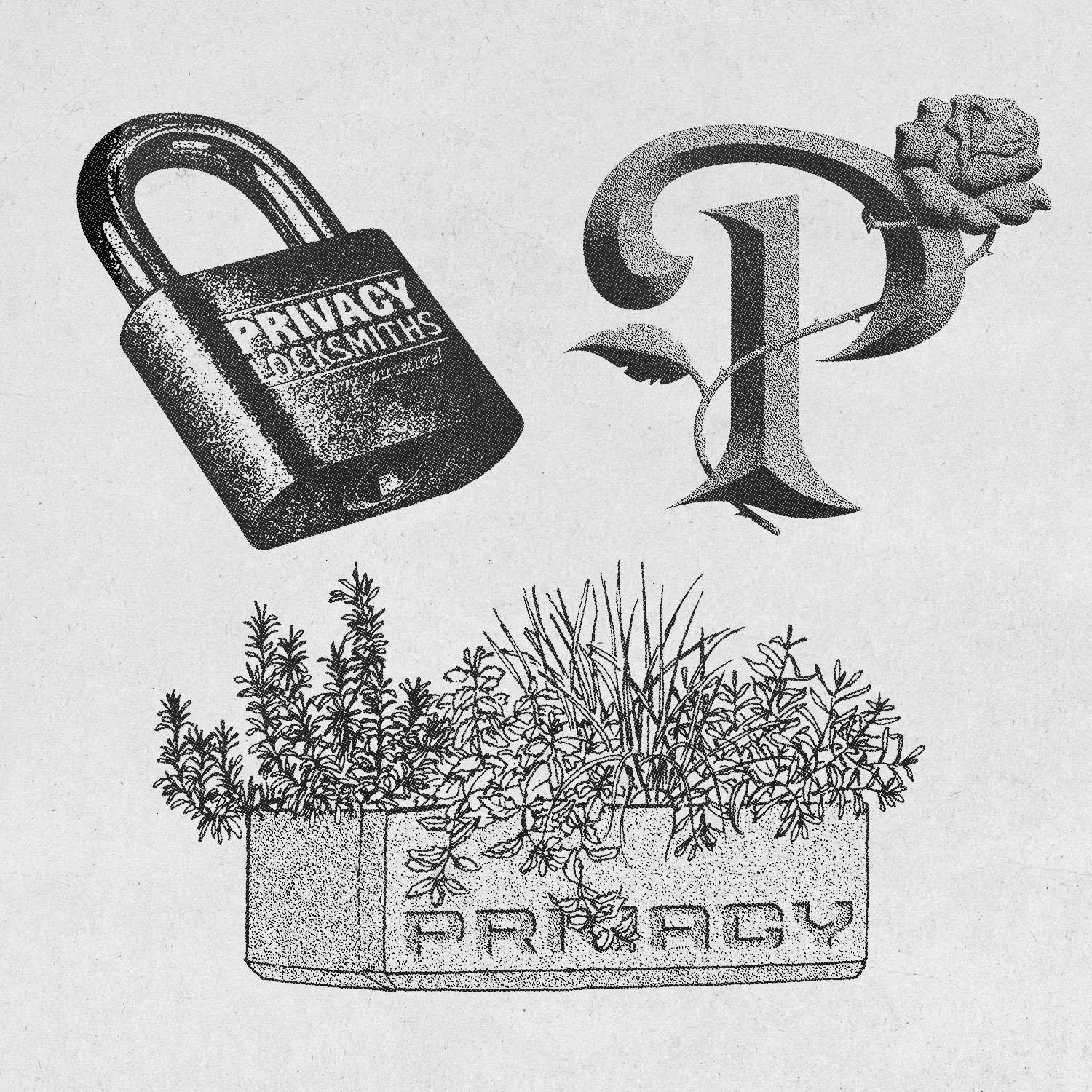
I pulled from heritage brand marks, brutalism and classic European imagery to give the collection weight and permanence, a padlock, a monogram 'P', a reworked mark tilted onto a brutalist grid, graphics that felt like they'd been around longer than the label had. Once that demand proved out, SS26 gave me room to push further into colour and story, tying the collection back to the owner's Italian roots and the country's scenery, cafe culture and fresh produce, timed to land through the summer. I built out textured type treatments like "Privacy: The Italian Dream, Capri, Italia" alongside illustrated pieces like an Italian shoreline applied across the back of the signature cut-sew tee, all set up as production-ready artwork for single colour screen print and digital direct print application.
Two collections, two completely different visual worlds, but both built on the same foundation: let the product do the talking. SS25 sold out on release with strong reception from customers, and SS26 has already generated high interest off the back of teaser posts alone, ahead of its own drop.